The faculties of Wrocław University of Environmental and Life Sciences have new symbols. They were designed by Dr. Łukasz Paluch from the Academy of Fine Arts, who explains how they were created, what inspired them, and whether their creation was a challenging task.
Dr. Łukasz Paluch is an assistant professor at the Faculty of Graphic Arts and Media Arts, in the System Design Studio at the Department of Graphic Design at the Academy of Fine Arts in Wrocław. He is also the founder and designer at AnoMalia Art Studio. He specializes in projects for cultural institutions and sound and visual artists. He has collaborated with institutions such as the Zachęta National Gallery of Art, BWA Wrocław, the Central Museum of Textiles in Łódź, the Andrzej Wróblewski Foundation, the Art Transparent Foundation, the National Forum of Music in Wrocław, the National Library, and publishers Wolno and Warstwy. He has also designed album covers for bands such as Skalpel, Nervy, Alameda 5, Ukryte Zalety Systemu, Fleshworld, and Wacław Zimpel.
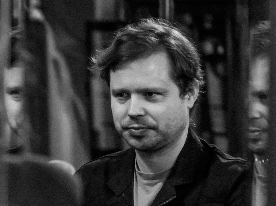
Dr. Łukasz Paluch – Author of the New Faculty Symbols at UPWr Photo: Private Archive
In 2020, he won the main prize for the cover of Fleshworld's album "The Essence Has Changed, but the Details Remain" and an honorable mention for the cover of Alameda 5's "Eurodrome" in the Polish Graphic Design Awards, in the category of Music or Film Publishing. That same year, he won first place for Best Cover and second place for Best Graphic Design in the Cover awArts 2019 competition for the best Polish music album cover. He also received an honorable mention for the book design of "HERSE. Warszawski Dom Mody" by Agnieszka Dąbrowska, published by the Museum of Warsaw in the 60th PTWK Competition, Most Beautiful Books of the Year 2019 (Category I – Literature).
For the Wrocław University of Environmental and Life Sciences, he designed six new faculty symbols. Specifically, he created one from scratch for the new Faculty of Spatial Management and Landscape Architecture, and simplified and modernized the other five, trying to preserve at least one distinguishing element of each. Using advertising language, these five symbols underwent a rebranding to form a cohesive whole with the new one.
– These symbols are part of a larger whole, which is the university's identity. They are part of the visual language the university uses to communicate both externally and within its structure. Our task was to unify the existing symbols, which were created by different graphic designers at different times. We aimed to do this more modernly and to create a uniform graphic system – explains Dr. Łukasz Paluch.
The symbols assigned to specific faculties distinguish their websites. Faculties can also use them for official documents, thus facilitating communication. This graphic language expresses the identity of each faculty as well as the identity of the university and its research areas.
From left to right, the symbols of the faculties: Spatial Management and Landscape Architecture, Biology and Animal Breeding, Veterinary Medicine, Biotechnology and Food Science, Environmental Engineering and Geodesy, and Natural and Technological Sciences.
– The faculty symbols consist of several elements, both literal and metaphorical, depending on the intentions of each faculty's administration. Each faculty wanted to highlight and graphically represent its scientific and research focus – says Dr. Paluch. He adds that such a task can be divided into two parts. One is finding an aesthetic key for how the symbol will be designed, its structure, and whether it will consist of one element or several. This key should satisfy all participants in the process, including the clients and the graphic designer. It turns out that the designer does not solely decide the creation process. Both sides participate in the design process. The second part of the task is the actual creation process.
At the Wrocław University of Environmental and Life Sciences, the graphic symbol of the newly established Faculty of Spatial Management and Landscape Architecture became the reference point – it was created first, and it was clear that the other five symbols should refer to it graphically and aesthetically.
– "During the work, we discussed with faculty representatives, exchanging aesthetic inspirations. For example, in one discussion about the new faculty's symbol, references were made to the Bauhaus symbol and the cover of the cult album 'Nowa Aleksandria' by the punk band Siekiera. This was a musical-graphic, cultural code for me, but I also aimed to include both the rich history of Polish design and modernity in these symbols. In short, we wanted to combine tradition and current trends," emphasizes Dr. Łukasz Paluch. "Based on the new faculty's symbol, we created a construction grid and all the graphic elements we use, such as three line widths."
The symbols were enclosed in a circle, referencing both earlier symbols and the university's logo. It was also important to retain elements from the previous designs.
– The rest depended on conversations with faculty representatives, as each had a different story to tell. For example, the symbol for the Faculty of Veterinary Medicine was essentially a redesign of the existing one. The motif was already defined but was simplified and adapted to the new construction grid – explains Dr. Paluch.
A color palette was already established for all symbols as part of the university's identity. The graphic designers respected the previously introduced rules, but the final outcome was a compromise between their vision and the vision brought to the design process by the faculty representatives.
– It was an interesting experience because I encountered many different opinions, and I didn't agree with all of them, which is natural. The first symbol for the new faculty was created the fastest. Here, the essence was metaphorical, symbolic, and humanistic thinking. The other faculties are more concrete, but ultimately, all the symbols have a cohesive structure and look good together, which was the goal – smiles Dr. Łukasz Paluch.
How do we conduct research in the age of AI? How do we teach research integrity and honesty in practice? Scientists from UPWr have just received funding from the National Agency of the Erasmus+ Program and the European Solidarity Corps under Action 2, Partnerships for Cooperation.
The combination of modern technologies, synthetic chemistry, and natural resources has allowed for the design of next-generation packaging materials. Scientists from Wrocław and Chile participated in innovative research on their antibacterial properties.
This site uses custom cookies to ensure that it functions properly. Some are necessary for the page to run, so will always remain active. These cookies will store information about the user's cookie settings. In addition, third-party cookies are used for external tools. For more information see the privacy policy.
Purpose
Enables storage (such as cookies) related to advertising.
Agreed
Sets consent for sending user data to Google for online advertising purposes.
Agreed
Sets consent for personalized advertising.
Agreed
Enables storage, such as cookies (web) or device identifiers (apps), related to analytics, for example, visit duration.
Agreed
Enables storage that supports the functionality of the website or app, for example, language settings
Agreed
Enables storage related to personalization, for example, video recommendations
Agreed
Enables storage related to security such as authentication functionality, fraud prevention, and other user protection